

Quantitative COVID Vaccine Propaganda is not the Way to Promote Vaccines
Quantitative COVID Vaccine Propaganda is not the Way to Promote Vaccines
It’s also just kind of uncool to lie as a news organization.


A friend of mine shared on social media this article from NBC News, by the deputy data editor for NBC news. And boy, is it…. not great. This article is part of a general - and to me disturbing - media and institutional science industry propaganda campaign regarding vaccines where evidence is presented in deliberately misleading ways, inferences are stretched, and unreasonable confidence communicated in the service of boosting the idea that vaccines are the transcendent and ultimate solution to all our woes (and by extension those who don’t vaccinate are causing all this harm). And, as you will see this is propaganda. It’s framing information to say something it doesn’t. Indeed, information that may even say the opposite! You don’t get less saying what you mean than that.
Hand to brow, my friends. Hand to brow.
Now, as a supporter of good science, critical reasoning, and vaccination campaigns in a free society generally I think this is problematic. But this text is such a classic case of data malpractice, it’s worth going into in some depth.
We should begin with the title:
“Covid's resurgence in Europe, in 3 charts.” The charts are heatmaps of: Caseload percentage increases, percentage increase in deaths, and vaccination rates per country. The implication is that vaccination laggardness is driving the European outbreak, and then the subtitle:
“Eastern Europe has the biggest outbreaks and the lowest vaccination rates.” Here, the implication is that this outbreak is furthermore driven by Eastern Europe, and specifically those with the lowest vaccination rates.
Then, the article opens with a vague topic sentence: “Covid-19 cases are once again surging in Europe, and data show that the countries recording the biggest rebounds are lagging in vaccinations.” This seems to imply, ‘we are reporting a weak correlation here’. Moreover, when combined with the prior title and subtitle, it also implies, and ‘it is driven by Eastern Europe’. As it will turn out neither of those weak and general claims are substantiated in the slightest by this article.
The Difficulty with Differences
Let’s read on: “According to data from the Johns Hopkins Coronavirus Resource Center, cases have risen in almost every European country over the last two weeks. In 13 of 45 countries, new cases have more than doubled.” Well, yes, Europe is in quite a mess! But, ‘doubling’. What does that mean? That’s a troubling indicator, right?
Consider: If I have a very low caseload - say 20 per day - and then it goes up to 40 per day. That is a doubling, or a 100% increase! But then, a country could have 100 as their base caseload, and then it goes up to 120 that is a mere 20% increase. Now, assuming those two countries have an equal population, which one is doing better at fighting Covid? Would low vaccination status be a suitable causal explainer for the different performance of these two countries regarding Covid caseloads? Of course, it wouldn’t!
“The outbreaks in Europe are among the most severe in the world; six of the 10 countries with the biggest case increases are on the continent. The increases are most severe in Eastern Europe: The Czech Republic, San Marino, Hungary and Poland lead the continent with new case numbers that are more than triple their mid-October levels.” [emphasis added]
The entirety of the analysis is done on the basis of percentage change over a two week period. However, no accounting is made to adjust the base rate at the beginning of the two-week period. Nor any adjustment for population, nor any accounting for historical trajectories that have led to different base rates. Did the Czech Republic, with it’s soaring percentages, have a low overall level of infection two weeks ago? I don’t know by looking at this. What I do know is that waves tend to increase exponentially, and which part you take your first indicator on that increase is going to matter tremendously for what kind of percentage change you calculate.
So, is there anything sensical in these data? There is one easy way to tell (and lots of harder more laborious ways). We must assume that there should be some relationship between caseload change and changes in deaths. This still might not be neat, depending on base rates, but if there is signal in the noise, there needs to be some relationship between the two. And, indeed, there is:

This is unreliable, with a large spread, and basically the two data points in the bottom left and the three in the top right drive most of the relationship. But, a simple correlation shows a relationship of 0.64, and when the percent change in deaths is regressed on caseload change we find a statistically significant positive relationship, such that with each additional percentage change in caseload accounting for a half a percentage point increase in deaths. The data isn’t just noise. It’s not clean but if there was no detectable relationship here, we would have to just stop and say: This journalist just reported noise as data.
Therefore, we have some reason to continue on to address the comparative analysis from which the author hopes to suggest to his readers that unequal vaccine distribution, and vaccine resistance in Eastern Europe is an explanation for the latest European wave.
But, I have to state with some pride that the sophomores in my college who have taken our curriculum would not make such a silly decision as to use indicators of change in this way.
How Not to Do Comparative Analyses
Then the article speedily decides to get going on it’s intuitive (rather than statistical) correlational analysis where it tells us that:
“Covid-related deaths across Europe have also spiked, with Hungary, the Czech Republic and Latvia accounting for the biggest increases over the past two weeks.” but that “vaccine rollouts have been slow in several Eastern European countries. While more than 7 in 10 people in Portugal, Spain, Iceland, France and Ireland have received at least one dose, vaccination rates in Bulgaria, Ukraine and Belarus have yet to reach 30 percent. By comparison, 67 percent of people in the U.S. have received at least one vaccine dose, and Portugal’s 87 percent vaccination rate is the second highest in the world.”
A critical person might ask then, if vaccines are the answer to the story of the European wave implied by these data and charts, then why are Bulgaria, Ukraine, and Belarus not particularly dark on those maps. One might also ask why no one mentioned Romania, which is one of two green countries on the map with improving conditions, but with an abysmal 37% vaccination rate. Well, those are certainly very inconvenient data points, given the subtitle of the piece: “Eastern Europe has the biggest outbreaks and the lowest vaccination rates.”!
That’s the problem with what we call ‘cherry picking your data’. You can’t draw an inference about the outbreak on the continent by conveniently cherry-picking cases. So, what happens if we look at these data systematically rather than using weird heat map graphics and some story telling?
Let’s Make this Inappropriate Data Squeal!
Thankfully, the article provides the raw data they used to develop their charts. As such, even though this data is inappropriate, let’s for the sake of argument suggest it is appropriate for the question to look at these percentage differences over a two week period. Then, let’s do the comparative analysis better, if not perfectly. We will see if a country’s vaccination rate statistically significantly predicts performance in the latest European wave in terms of changes in case-loads.
First, let’s eyeball it by looking at a plot of the relationship of national vaccination rates on caseloads.

That’s not a very clear picture. Indeed, when we look at it overall, we find something rather shocking. It would appear that higher vaccination rates are associated with higher percentage changes in caseloads in the last two weeks! Indeed, a regression model shows that for every 10% increase in vaccination a country is rewarded with a 7.5% increase in the change of cases in the last two weeks! Everyone, stop vaccinating! It’s bad for you!
Clearly, that’s nonsense.
But regardless, here we are looking at a correlation in the wrong direction. Blessedly, as we probably knew already, this is a non-statistically significant relationship. There is at least a 1 in 5 chance that this relationship would emerge by chance if the true relationship between vaccination and caseload change was zero. That’s good, because it means that we don’t have to take any of this too seriously. We can keep vaccinating and be evidence driven, because there isn’t much evidence of anything here.
But the Eastern Europe story clearly doesn’t hold up. Indeed, the countries cherry picked by the author for their ‘very low’ rates have perfectly low increases in infections (including the Ukraine - pictured at the top of the article). Is it because their base rates were already high? I don’t know and you don’t either. The author doesn’t provide nor refer to such data! (But I will turn to it later) Only a handful of Central and Eastern European countries with vaccination rates in the neighborhood of the United States' level seem to be really blowing up right now.
What we can say is that a lot more is going on here with caseload changes and vaccination rates than the simple narrative of ‘more vaccinations, less cases’ that the article seems to hope to imply (and the few people I saw sharing on social media wanted to imply with it). Likewise, Eastern Europe isn’t driving anything. Three Central European countries are, maybe: The Czech Republic, Hungary, and Poland. Vaccinations, statistically, generally predict nothing about caseloads with these data, and if we ignore the insignificance of the relationship, it is in the wrong direction and we need to stop vaccinating. (I emphatically do not recommend this!)
Consequently, contrary to the insinuation of the article, the European outbreak cannot be easily explained, nor the varied locations of the outbreak, by vaccination levels. Far more is needed to demonstrate that case, and it will inevitably have to deal with a great deal of detail and argument weakening caveats to get to that conclusion. There will undoubtedly be a healthy relationship between vaccination rate and performance, but it will be rather modest compared to the expectations of the author of the NBC piece or even that I find in my analysis here.
But, despite what is often implied by other propaganda that wants to associate Covid-vaccines with vaccination campaigns such as those for Polio or Measles, vaccines have been stubbornly unreliable at providing blanket reductions in infections. Behavior matters a great deal, as does the natural immunity (attained from getting sick and recovering from Covid) among both the vaccinated and the non-recently vaccinated.
This is not as true for severe illness. Vaccination has been reliably effective at reducing severity (albeit less than new treatments). As such, we would expect a better relationship.

But it isn’t that much better. We lost some cases, because they couldn’t calculate a percentage change, because the number of deaths two weeks ago (AKA: the base rate, ha!) was 0 two weeks ago. But, again, we have the same problem. We seem to have another relationship in the wrong direction such that each additional 10 percentage point of the population vaccinated results in a 3.5 increase in the percentage increase of deaths. And if that sounds like a tongue twister of an interpretation that leaves your head scratching - That’s another reason why using the percentage differences as this author does is so strange and unhelpful. But, blessedly, this relationship is even less statistically significant than the last one. This relationship is basically as good as a coin-flip. We basically can figure out nothing about this relationship from these data. In these European data the rate of vaccination has no systematic relationship to the increase in deaths observed in the last two weeks. Great job, NBC!
So What Can We Learn From The Information in the NBC Article?
Well, from the author and the article, we can ignore nearly everything that is written. It is all smokescreen and agenda driven cherry picking. You could easily use that approach to tell the opposite story with these data. Indeed, as the above plots demonstrate, you could make that case more easily. By cherry picking from this data, it is easier to claim Western Europe is driving the pandemic, and that vaccinations are increasing caseloads and deaths, and thus the aggressive vaccination campaigns are driving public health problems.
So, basically what it tells us straightforwardly is that we seem to be having an outbreak in Europe, and the increase in deaths are reliably related to the increases in caseloads.
Yeah. I don’t know why this was written either.
From the response in this post, however, I think we can learn a bit more. Or, at least, we are given more suggestive avenues to think about. Some of those might be thinking about the regional clustering of data. Different regions may have their own phenomena that are setting the base-rates of different indicators. It’s hard not to notice that ‘some of these countries aren’t like the others’. We might have good reason to doubt the data quality of many of the countries in the bottom left quadrant of the plot. If we eliminated them (rather than using them, as the author, as nice data points to cherry pick highlighting dismal vaccination rates) we would find a relationship that is less bizarre. We would see a decrease in caseload increases on average, with high variability at lower vaccination rates, and now with high vaccination rates. We might very well expect this, as vaccination prevents infection, but non vaccination does not guarantee infections. You can be unvaccinated, and just not have a covid spread in your country. Maybe you are from a small island like Cyprus?
Another might be the historically derived contributions to natural immunity. The Czech Republic, for instance, had a very light spring and summer after a devastating autumn to winter wave last year. Their terrible performance may be driven by a combination of poor vaccination coverage and waning natural immunity not as apparent in some other countries.
Of course there are also behavioral factors that vary across national polities. As someone who spends a great deal of time jetting between the Czech Republic and the Netherlands I can attest that the Czech attitude towards the rules is far laxer, if not downright resistant at times. This, if what we are told is true, should also matter a great deal, and it is true as well that compared to America, Europe has been psychologically far more relieved over the past 4 months. My American peers are still in a far more embattled pandemic mindset than my neighbors or family in the Netherlands or the Czech Republic.
Regardless, the pattern and rate of these data are not strongly related to vaccination rates unless we include many other explanations. Moreover, those explanations do not well indict Central and Eastern Europe as the driver of the outbreak whatsoever.
Consequently, there is no pattern in these data justifying a concern about unequal vaccination between countries as significantly related to this outbreak.
Perhaps more damning, NBC has given no support nor demonstrate the relationship suggested in the title and subtitle that (a) these three charts explain or even well illustrate the resurgence of covid in Europe nor (b) does the data suggest Eastern Europe has the biggest outbreaks and the lowest vaccination rates. Indeed, no relevant data is given for that last point, although it might be true!
To evaluate that you would want to get a different measure of the size of outbreak than the - by now, much maligned- percent change variables. Rather, you would want something that scales to population, such as ‘cases per 1 million people’ and then see if levels of vaccination strongly predict those, and where Eastern European countries are clustered at the top. So, when we do this journalist’s homework, do we see this? Well, that’s easy, so I will check (just for you!):
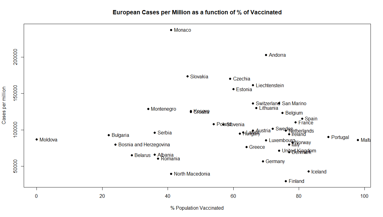

Basically, neither the data in the article nor basic attempts for more appropriate data bears on the point the author wants to make with it. Indeed, the better data shows an even worse result for vaccinations predicting deaths per million, presenting a scatterplot that suggests a regression coefficient that is essentially zero: No relationship at all.
We could go a step further and look at the nominal contributions of raw numbers of cases and deaths, but at that point we are far afield from the claims of this piece and writing a new one entirely. If it happens on a student’s paper that they utterly fail to demonstrate their thesis, but rather I could imagine some other way to get a similar thesis using something like what they were doing… that is a failing paper. When I taught introduction to statistics I failed students for handing in papers of this quality. It is rife with well-known errors and pitfalls. This is a picture perfect example of using data dishonestly. That’s bad for science, bad for pandemic politics, and bad for public trust, generally.
Bottom Line
Lying with data is bad. It’s particularly bad if you implicate important knowledge centers like Johns Hopkins in your journalistic malpractice. My friend angrily rejected my criticism of this troubled and troubling piece on social media, by suggesting that I “must have my head up my ass” to think that my college sophomores and I could out-perform the conclusions of Johns Hopkins medical scientists laid out in this article and, er… heatmaps. Of course, they had nothing to do with this irresponsible quantitative tire-fire. This was all the author’s doing and the NBC news editor’s enabling (and my friend’s fault for amplifying this nonsense).
Ultimately, this is understandable. Quantitative expertise has never been more in demand, and budgets for good journalism have never been so low. But in this case that is very dangerous as our society and important decisions become increasingly data driven. Never before has solid statistical and data literacy combined with classical critical thinking skills and a critical eye been an important component of the human capital for our self-governing societies as now. And, tomorrow, it will be even more important.
Yet, most of higher ed in my experience (and conversations with my colleagues in the statistical sciences confirm this) has moved away from such concerns. Universities are more keen to ‘equip their students with the tools for the workforce of tomorrow’. It’s not important to be able to critically reason about and consume information, but rather to be able to run and interpret an ever wider array of tools and approaches. Basic understanding of data, measurement, and inference are neglected in favor of technical competence that provide a false confidence to the person practicing it. This I have seen countless times at all levels of academia. Many decorated professors don’t even understand the analyses with their names on them. Maybe the graduate students that did it do. Maybe they don’t. You often can’t be sure.
When I look at the background of the author, deputy or senior data editor Nigel Chiwaya, I see a potential product of such education. That is not to dismiss his skills. He has proficiency in things I sure wish I had at my fingertips. My guess is that he visualizes, scrapes data, and generally manipulates data frames with greater alacrity, precision, and panache than I could on my best day. But, there are fundamentals that get inadequate attention when we have our education focus so much on the surging technological tools at our disposal to the neglect of fundamentals of inference.
Citizens need to be wary of these quantitative arguments not because statistics lie. It doesn’t. But if you don’t know some basics very well it can be incredibly easy to lie and mislead with statistics - whether through error or malice - because ultimately numbers communicate a concreteness and certainly the human soul craves. This is doubly true when one is fearful (like during a pandemic).
Issues like the pandemic are when we need the most careful reporting on data and science imaginable. Not frantic grasping at numbers that, if you glance at them after throwing back a shot of cognitive bias and stare cross-eyed through the bottom of the glass at the table, you can make out the pro-vaccination message you think is desperately needed in your community right now. Truth needs to come before persuasion, or any persuasion you build is on the most fragile of grounds. It causes, rather than reduces unease about vaccines. The desperation of propagandists is odorous to those who are not already sold on what they are selling. When what they are selling are important vaccines, that is a big problem.